Big Bridge...and New Website Launch!
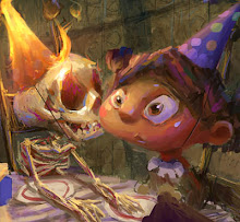
 The more I paint, the more I seem to appreciate the appeal of a limited palette.
New Website Announcement!
I've been working on a brand new site for the past few months with a really skilled kid named Taher Ali (he's only 17!). His cousin, Danial Jaffry did the coding. Both did excellent work, and the site was launched today. Take a look!


20 Comments:
hey, great colors!
Bro, I am there with you 100% on the limited palette thing .. . . . . beautiful piece!
Oh, wonderfull!!!!
-*.*-
sweet. Love the limited palette and the atmosphere.
The new website looks really great bro!! As does this piece. I like the pink lighting.
Marco, nice piece.. you're right singin' the praises of a limited palette. Awesome job on your website, when can I hire that kid to do mine!?
awesome Marco! , you got a characteristic style .
.I like this one , and the other (dragon pic)
.Congratulations my friend!
Hey marco
The website looks slick, nice to see some of your other work too. Don`t limit that palette to much now. Variety is the spice of life har har har!
Wow! a masterpiece! beautiful colors!!
dude,
the new website looks amazing,
good stuff,
i miss working with you,
cheers,
your pal always,
devries
Marco, great stuff as always! Congrats on the site, man! It's freakin beautiful... I'm jealous.
Ah...this is great!
I like it.
Brilliant! Your website looks super cool!
Hi Marco, i was just looking at your bio and your new site and i saw one of the backgrounds for Grossology :D!! I always liked the colour styling and thought it was one of the most amazing parts of the show. I was an animator for season one and am super glad to finally find out who was involved with the colors!! :D Anyways cool new website, very neat!
I enjoyed your blog and website. Lovely work. I can see Morgan's influence! That is a good thing.
Thanks Johanna! Morgan is the best.
This comment has been removed by a blog administrator.
Nice mood!
The new site is looking great.
Post a Comment
<< Home